On Home, immediate needs and discovery content competed for the same attention.
Techcombank · Reframing the Mobile Banking Home. An independent concept study.
- Role
- Product Designer
- Timeline
- January to May 2026
- Team
- Solo
- Platform
- Mobile app
- Method
- Market research, competitive benchmark, public review analysis (AI-assisted clustering, samples checked by hand), UX audit, JTBD, IA, interaction design, validation planning
Research without internal access
Signals point to friction. They do not prove prevalence.
Three sources did three different jobs: market data set the behavioural context, a competitive benchmark showed the expectations people have learned, and public reviews exposed recurring breakpoints.
- 73.32%Mobile transaction volume growthAverage annual growth cited for 2021 to 2025 (State Bank of Vietnam data and the Connected Consumer report, as cited in the research). It raises the cost of friction, because mobile banking is now a habit.
- 10 appsBanking and fintech benchmarkCompared balance presentation, visibility control, navigation, QR access and transaction patterns.
- 153 of ~1,000UI/UX-relevant public reviewsClustered with AI assistance, then representative samples were checked by hand.
Evidence boundary
These sources justify investigation and a concept direction. They cannot tell us how many current users fail, what their baseline time is, or whether the redesign improves behaviour.
Two themes appeared repeatedly in the reviews.
- DiscoverabilityAvailability is not accessibility. A buried feature still fails when the user must act quickly.
- ConsistencyIn a financial product, unpredictable interface change can read as service instability.
Of the 153 relevant reviews, 72 concerned the experience, 62 the interface and 19 both. Review data is reactive and selection-biased: repetition makes a theme worth testing, not automatically representative.
Why does Home make users search?
The first answer is visual competition. The working diagnosis goes deeper: the screen seems to have no explicit rule for assigning priority by attention type.
Why might users spend extra effort finding an action?
Because several modules compete with similar visual priority.
Why do several modules ask for attention at once?
Because Home must support account context, transactions, instant access, services and business content.
Why does supporting many jobs create friction?
Because careful, urgent, reassuring and promotional jobs are exposed through similar priority patterns.
Why are different jobs exposed similarly?
Because, judging from public evidence, the screen mainly mirrors product modules and distribution needs.
Why does product structure dominate?
Because Home is treated as both the start of action and the surface for the entire ecosystem, without a governing attention model.
Working diagnosis: Home lacks a shared, enforceable rule for separating jobs by attention need: orientation, reassurance, deliberate action, urgent action and discovery.
The issue is not that any layer is invalid. The issue is that users must work out the priority themselves before they can act.
One Home, four jobs
Priority follows urgency and risk.
| Layer | The user is asking | What it needs | What breaks today |
|---|---|---|---|
| Trust | Am I in the right place, and is my money okay? | Visible identity, stable balance, clear account state. | Reassurance competes with shortcuts and content. |
| Core | Help me finish correctly, not merely quickly. | A low-noise transaction area with review and confirmation. | People scan a broad grid before they start. |
| Quick | A fast response under time pressure or uncertainty. | Persistent access to QR, Cards and Notifications. | Urgent actions behave like ordinary shortcuts. |
| Growth | What else could be useful after my primary job? | Offers and services placed after the utility layer. | A suggestion feels like an interruption. |
Home should not optimise every job for speed. It should match visibility and placement to urgency, risk and decision effort.
Instead of starting with a new visual style, the redesign gives each zone one primary mission and a deliberate place in the user's attention. Context orients. Trust stabilises. Core focuses. Quick accelerates. Growth waits for the right moment.
Five decisions, each with its cost
Each decision protects one job and accepts a specific trade-off.
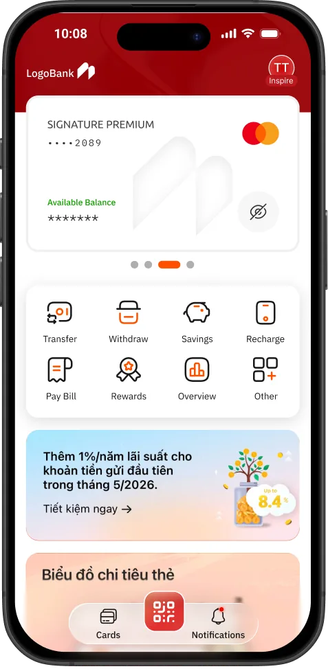
- TrustMake balance stable before making it prominentGive the balance module clearer breathing room. Keep the visible, hidden, loading, offline and error states at the same height. Make the visibility control at least 54×54px.Rule Trust comes from stability, not size. Cost More vertical space above the fold.
- ContextKeep identity visible but secondaryA compact avatar and account status confirm the right personal space, and separate identity from financial status.Rule Context should orient, not dominate. Cost One more element in an already busy top area.
- CoreSeparate deliberate transactionsKeep Transfer prominent in a focused area and collapse secondary actions where it makes sense.Rule Careful actions need a low-noise start. Cost Some lower-frequency tasks move one level deeper.
- QuickReserve persistent access for urgent jobsA three-item bottom area for QR, Cards and Notifications, with large touch targets of at least 48×48px.Rule Less searching under pressure. Cost Bottom navigation capacity is intentionally limited.
- GrowthPut business content after utilityKeep banners visible but below the orientation and transaction layers, cap their height and move secondary campaigns elsewhere.Rule Suggest after reassurance. Cost Early campaign exposure may decline, so click-through has to guard it.
Modernise the hierarchy, or the whole presentation?
Both directions use the same layered logic. They disagree on how much familiarity to spend on visible change.
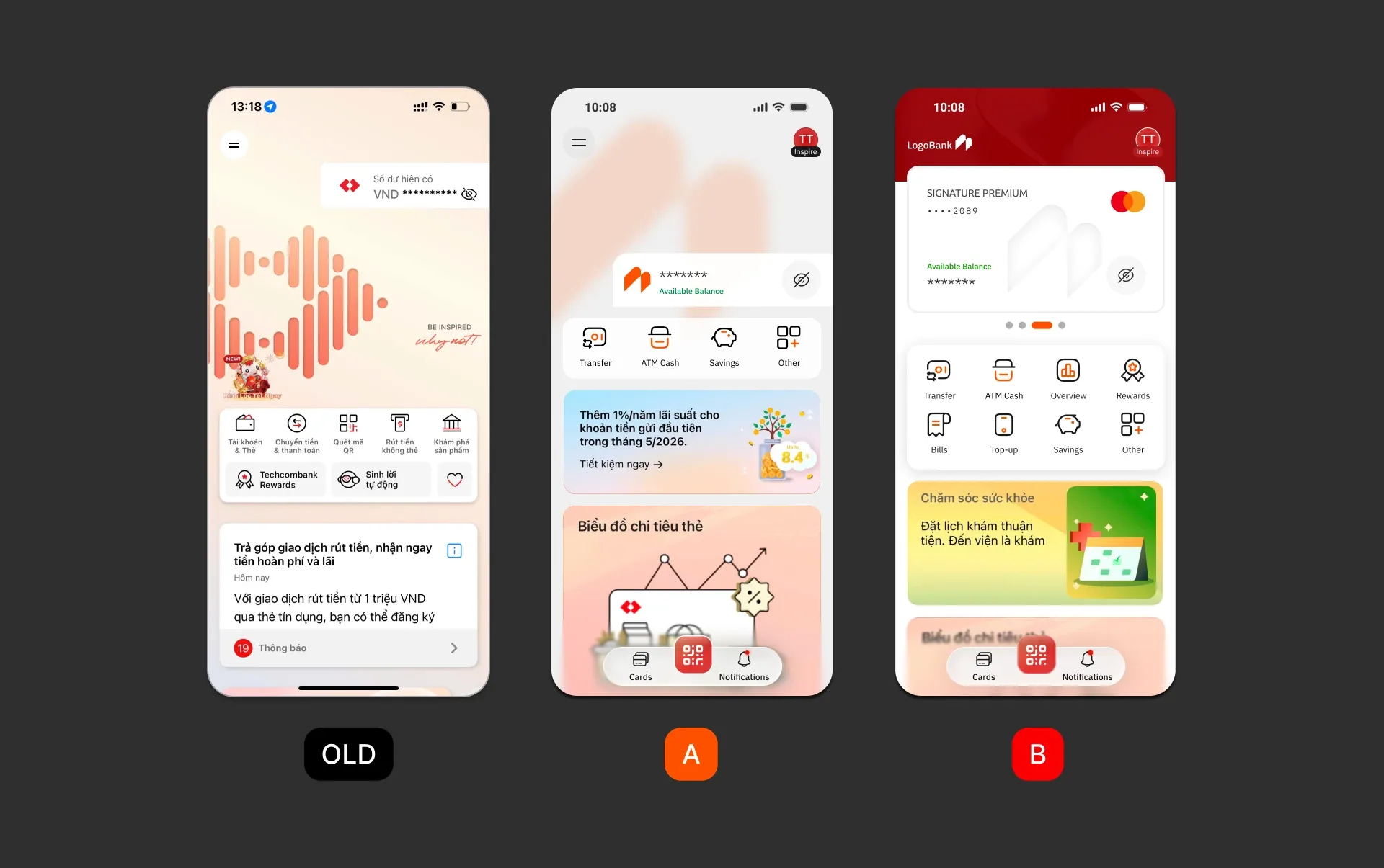
Option A · Controlled Chosen
Preserve the familiar mental model. Change priority, spacing, state behaviour and the position of quick access.
Strengths
- Lower learning cost
- Safer staged rollout
- Clearer causal measurement
Weaknesses
- Less dramatic visually
- Some legacy constraints remain
- May underserve a rebrand goal
Option B · Card-based
Repackage identity and balance into a large financial card for a more premium, fintech-like presentation.
Strengths
- Stronger visual shift
- More modular top area
- Clearer rebranding signal
Weaknesses
- Pushes actions lower
- Higher relearning cost
- More support and rollout risk
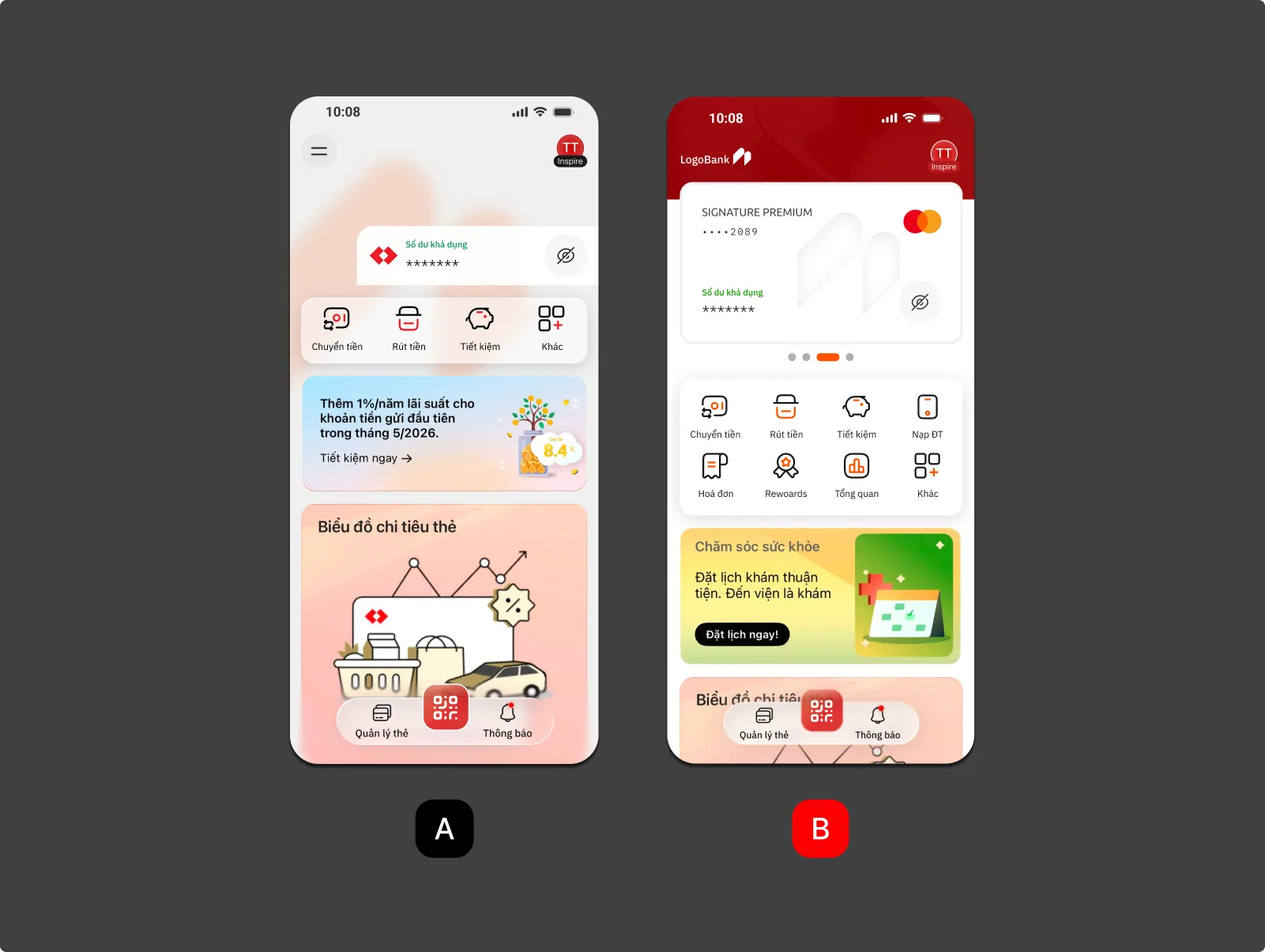
My decision is Option A.
The stated objective is reducing everyday friction, not announcing a rebrand. If the real business objective were perceptual transformation, Option B would be the honest choice, but it would need a different research plan, migration strategy and risk budget. The comparison is a decision aid, not quantitative evidence.
No metric, no claim
This concept has not been released. The next valid step is to measure the baseline, not to polish the UI.
- Instrument the baselineMeasure current time-to-action, success, entry points, banner click-through and findability-related support tickets.
- Test both user groupsRecruit 8 to 10 participants across frequent and less-frequent banking behaviour, because they fail differently.
- Compare guarded outcomesSpeed up QR without slowing transfer; improve clarity without collapsing familiarity or business performance.
- Roll out by layerVisual foundation, then Balance, then Quick Access, then Growth, each with its own decision gate and rollback trigger.
| Metric | Decision it protects | Direction | Status |
|---|---|---|---|
| Time-to-QR | Quick Access improves urgent action | Decrease vs. current | Needs baseline |
| Time-to-transfer | Separating actions does not harm the core job | No meaningful increase | Guardrail |
| Core task success | Hierarchy improves findability and completion | Target set after baseline | Needs baseline |
| Familiarity score | Controlled change protects learned behaviour | No sharp decline | Guardrail |
| Banner click-through | Later placement does not destroy growth value | No meaningful decline | Guardrail |
| Support tickets | Navigation change does not create feature loss | No increase in "can't find" reports | Guardrail |
Behavioural clarity beats visual novelty. A cleaner grid looks better for a while, but new campaigns will recreate the same competition if the prioritisation rule and its owner do not change.
- Product, Design and Growth agree which job types may occupy each layer, and what evidence is needed to change a priority.
- Track jobs, not modules: entry point, time-to-action, completion, error and recovery for QR, transfer, card control and notifications.
- Ship independently measurable layers with explicit rollback thresholds, instead of one bundled redesign.
What this study does not claim
Public reviews reveal themes, not the share of users affected. A cleaner hierarchy does not guarantee faster task performance until it is tested. Moving banners may improve receptivity or reduce exposure, so click-through and downstream conversion must decide. Even controlled changes can break the habits of daily users and need rollback protection.
Seek Discomfort!
Ready to collaborate? Tell me what you are building.
vuhm.work@gmail.com- Phone
- (+84) 92 7474 800
- Open
- Monday to Friday, 9:00 to 18:00